Picking Accent Colors for Junk Journals
One of the many things I love about Junk Journals is how creatively free you can be. There are few rules and little pressure to follow them.
I tend to finish off my Junk Journal Projects with a final touch/layer/whatever… I was looking at this group of Mass Make cards and realized they’d be a good example of one of the different ways I do this. 😉
In these examples – part of my projects for the Junk Journal #100DayChallenge – the final touch was stamping with a vintage Business Stamp I have (and yes, it’s a fav! 😉 )
I chose the ink colors I used for this final stamp carefully.
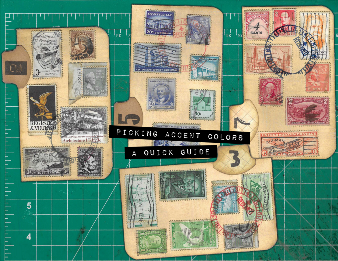
Starting in the upper left, with the Tab labeled 2:
This card is decorated with vintage stamps that are mainly gray scale. There is one stamp with a gold eagle and another that is in brown tones. But, for the most part, this decoration on this card is grayscale monochromatic.
In this instance, I felt like the gold eagle stamp and brown stamp offered good interest and contrast in part because they are variations of the actual colors of the card’s background and the whale tail tab. Therefore, I just finished everything off with the vintage business stamp using black ink.
Next – The card with the 5 Tab…
The decoration on this card was a mix of blue stamps with one green stamp. I wanted to pull attention to the green stamp, so I used red ink for the vintage business stamp.
Green and Red are complementary colors (Easy to remember… Just think Christmas.) Because of this, when you look at the card, the red stamp pattern and the green postage stamp are what grab your attention, while the blue range postage stamps are mostly just background.
Continuing on – The card with the 7 Tab…
Here, the vintage postage stamps are in the red and orange range. Sadly, orange postage stamps are hard to find or I’d have used them exclusively. As it was, I filled in with red stamps that were on the warm/orange side.
In this case Orange and Blue are complementary colors (Mnemonic… Sunset – Blue sky and orange sun.) and I used dark blue ink for the vintage business stamp. In the scan, the ink reads more like black, but in person, it is definitely dark blue.
Last but not least… The 3 Tab card.
On this one, the stamps are mostly green shades. The ones that aren’t are neutrals that won’t draw attention.
As I mentioned above, Green and Red are complementary colors (Remember Christmas) so for the final vintage business stamp, I used red ink.
As always, these are just suggestions… explaining what I did and why. But… Junk Journaling. 😉 You do you!
Tink Tip – Complementary Color Mnemonics:
Christmas – Red and Green
Sunset – Orange and Blue
Easter – Purple and Yellow
Here’s a coupon — 100DAYS2024 — to get 25% Off anything in my shop.
https://junkjournalephemera.etsy.com
NOTE – Stamps used are of my own design.
@RubberStamps_com #stampwithus RUBBERSTAMPS.com
Enjoy the Making 😉
IMPORTANT NOTE- Some of the links in this post may be Affiliate Links. If you make a purchase using one of these links, I may earn a small commission, but you DO NOT pay a higher price.